Monday, April 19, 2010
Event Poster
I am instantly attracted to event posters with bright colors-- they capture my attention and make me want to find out what this bold, fun event must be. Therefore, when I saw this poster for a Free Press Summer Fest outing in Texas I was instantly attracted to it. It's bright green and blue scenic drawing with bold pink bubble letters on the top yearned for my attention. I think this is key when designing an event poster. You must use colors that will capture a person's attention-- they would want to find out what the poster is for and therefore maybe come to your event because of it. The colors and design however, also need to represent the event or person or idea you are trying to get across. This poster was for an alternative/indie music festival and has a city-scape with people dancing in it. The bright colors work for this design whereas if it was for a heavy-metal music festival it probably would not have worked as well. Therefore, if you stay true to the person, band, or idea you are trying to publicize and use colors and features that will capture a person's attention, you will have an good event poster.

Tuesday, April 6, 2010
Bold Statements in Magazine Covers
I found this example of Esquire magazine with George Clooney on the cover to be quite intriguing. Not simply because George Clooney was on the front cover (i know hard to believe), but more so for the interesting design the company had taken for its front cover.
It is a great example of how black and white can make a bold statement. Clooney, the background, and all the type on the magazine cover are in black and white, giving the cover an edgy feel. What really captures a reader's attention, however, is the bright orange color the mag's title "ESQUIRE" is in. If you happened to be passing a magazine stand on the street, you would definitely notice this magazine cover.
Another creative angle I thought the magazine took was using a replacement image for a letter. The cover reads GEORGE in large typeface, but, as a reader, you cannot see the O in George as Mr. Clooney's head is taking up that space. This was a cleaver use of words, but also of the image they knew they would have on the front cover. It was creative in that they did not have to sacrifice space on the magazine cover; instead, they worked with the specific image they wanted to create a humorous way of presenting "GEORGE".
Overall I think this magazine cover is really eye-catching and has many elements that make it a really creative and clever design!
It is a great example of how black and white can make a bold statement. Clooney, the background, and all the type on the magazine cover are in black and white, giving the cover an edgy feel. What really captures a reader's attention, however, is the bright orange color the mag's title "ESQUIRE" is in. If you happened to be passing a magazine stand on the street, you would definitely notice this magazine cover.
Another creative angle I thought the magazine took was using a replacement image for a letter. The cover reads GEORGE in large typeface, but, as a reader, you cannot see the O in George as Mr. Clooney's head is taking up that space. This was a cleaver use of words, but also of the image they knew they would have on the front cover. It was creative in that they did not have to sacrifice space on the magazine cover; instead, they worked with the specific image they wanted to create a humorous way of presenting "GEORGE".
Overall I think this magazine cover is really eye-catching and has many elements that make it a really creative and clever design!
Sunday, March 21, 2010
Corporate Identity
It took me quite a while to find a corporate identity, or a logo, that I really thought did a great job with its' colors, typography, and images incorporating the message of the company. I finally found the United Way logo and was very happy with the overall message it represented. The colors are all very nurturing-- they are not too harsh, but still standout because of their brightness. The hand with the person underneath also suggests their message which is a helping hand and caring for others.
The image itself is very subtle but encompasses their message as an organization that they are there to care for others. The image is not distracting, just enhancing. I think any viewer looking at the logo can understand the message conveyed by the image, and especially because the United Way's mission of improving the lives of others by mobilizing the caring power of communities around the world can be visibly seen in this logo.
Sunday, March 7, 2010
Bad Advertisement
The ad I chose for my design project this week was an ad for a photography company called Creative Works Photography. The ad had a very outdated picture of a wedding couple with big blocks of text with the only color being a slight splash of red in the background. I did not think the layout, typography, or color communicated that it was a creative photography studio at all. I think the colors needed to be changed to make it more updated and show off a level of creativity so show that their name really encompasses who they are as a company. I think the picture needed to be changed to a more modern and relevant photo. I think the text needed to flow better within the ad as well, so there were not just big bold chunks of text all over the page. I think this would definitely help the ad flow better and work well to communicate the message that Creative Works Photography is trying to give off to potential clients.
Sunday, February 21, 2010
The Letter M in the World of Advertisements
We take the way typography enhances packaging and a products overall feel for granted. The font choice, the position of the lettering, the coloring and even more can make or break a packaging design. I chose to evaluate the letter M in various advertisements and packaging that we as Americans see all the time.
The first example I found of the letter M is the M from a Caribbean Rum bottle, Malibu. The font is a serif font and its very free flowing, lacking straight form with the edges not cut and dry. This gives off the feeling of an easy going, good time, which I think is a very prominent experience an alcohol company would want their company to give the impression of.
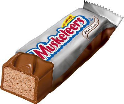
The second example I found is the letter M from a 3 Musketeers Wrapper. This font is very playful, due its balloon-like appearance. It seems almost little-kidish, which could appeal to young consumers and also to adult consumers who want to just take a time out from their busy lives to eat a piece of candy. Incorporating my last example, I do not think switching the fonts for the letter M of these packages would work. The fonts would not enhance the other product if switched. Each font works for its specific package, product, and purpose.
My final example of the letter M in packaging is from a Maybelline advertisement. This is a san serif font, with very straight thin edges and lines. This gives off the appearance of very classy and more upscale, which is a great persona for a make up to have. It is a very simplistic style but an air of sophistication to the product.
I think each use of the letter M in each packaging is well thought out and used well to enhance each product. None of the fonts would work as well if there were interchanged to be on another product. It's surprising how much each typography style has an impact on the product they are on, and how different one letter M can be from another.
Thursday, February 11, 2010
Color in Different Cultures
In the United States, Red means STOP, Yellow means SLOW DOWN, and Green means GO. Have you ever thought what these colors mean in various other cultures throughout the United States. This is exactly what I took the time to examine this week. As a tribute to Valentine's Day, let us investigate the color RED.
In the Western culture, red has two meanings; mainly love and/or rage and anger. However, in China the color red is meant to mean a celebration. By following the link you would notice all the Chinese decorations are all in red!
In South Africa, the color red is the color of mourning. It is used at funerals or to indicate various sorrowful events for a family or individual. In India, red is the color of purity, which is very different from the United States, where purity is indicated by the color white. In a completely opposite perception, the United States considers red as associated with the devil, while in India, the color red is holy and is instrumental in customs and beliefs.
As can be seen across cultures, one color can mean so many different things. In advertising and marketing, we must learn how color is perceived by various cultures so we can create ads pleasing to all areas of the world if we ever have the privilege to work worldwide.
Thursday, February 4, 2010
Color Schemes
I could have told you starting about 10 years ago that my favorite color scheme was lime green and bright pink. There was something about the combination of colors together that I found interesting and their vibrancy and brightness was an extra bonus. Come to find out lime green and bright pink are actually opposite each other on the color wheel, meaning they are complimentary colors. One real life example I found was the packaging on a Bed Head Hair Product called EGO BOOST. The bottle is bright pink, with a light green cap/pump. If I saw this product sitting on a self, my eye would immediately be drawn to it. Not only are the colors my favorite, but the vibrancy of the colors demand attention. This is an excellent marketing idea because consumers would be more drawn to this bottle than say a black and white bottle on the same shelf.
The color combination also adds to the overall perception of the product and brand. I would not look at the packaging and think "wow this is a pretty standard, boring brand of hair care products". The bottle makes it scream to the consumer that the brand is fun, funky and a brand for the more youthful at heart. Before learning about how much color impacts our thoughts on a brand and product, I would have never believed the color combination of pink and green could really change a consumer's perception of a product. However, now I see a color scheme can actually make or break the success of a product and a brand. MARKETERS BEWARE!
Thursday, January 28, 2010
The Elements of Design
Have you ever wondered what makes a composition, work of art, advertisement, or even a piece of graphic design harmonious? I can honestly say I have never taken the time to ponder this question until this week. Various design elements including balance, weight, scale, direction, positive and negative space, and repetition can all play a major part in making any piece of design pleasing to the eye in an interesting and unique way.
I found this week that I am a very symmetrical person. Not in my appearance or demeanor, but in the way I look at and create compositions. I found it increasingly difficult to create an asymmetrical. Every time I tried, it either turned out symmetrical or just a mumbled, jumbled bunch of shapes on a page; no balance at all. In order to rid me of my asymmetrical lacking, I looked up inspiration on the internet. One example of asymmetrical design and explanation really struck me. It explained and viewed how to create asymmetrical balance in a way that made sense to me. If you are having asymmetrical woes, follow the link above and you will steadily move toward recovery.
Thursday, January 21, 2010
What is Graphic Design?!
Do you know what graphic design actually consists of? On my search of this question, I did what any normal college student would: looked it up on Google. I, therefore, came up with this definition from aigi.org: "Graphic design is a creative process that combines art and technology to communicate ideas".
This definition is nice, but I wanted to dig deeper. What does graphic design really entail?! One thing is for certain: Graphic Design is around humanity almost 24/7. Think about it: From the wrapper around the Sobe Lifewater Juice I am currently drinking to the SELF magazine cover sitting on my desk, each was created by a graphic designer with a specific look, feeling, and vibe in mind. Each was made uniquely to communicate a specific message to its consumers and its audience. With this in mind, it is my opinion that graphic design is a thoughtful, creative process used to communicate a unique and pleasing message to consumers or a specific market. If graphic designers failed to complete the process, daily items we consume would be ordinary and bland. Therefore, next time you pick up any household item, such as a piece of gum or a box of band aids, think about the specific and unique graphic design of that product and what message and feel it is trying to communicate to you the consumer.
Friday, December 11, 2009
Google Enhances Its Social Media Ties
Google will now have, what it calls, a real time search page. Google's new real-time display will be more interactive than the usual static search engine results page we have seen previously. The display will feature a scroll along bar with a pause button that will allow people to stop and start results pages and the paid advertising on the side. With this new infrastructure, google will be partnering with Facebook, Twitter, and MySpace to get help with their real-time results. This will also give the most up-to-date trends for people to be able research.
My first reaction when reading this news story was, what difference will this really make with search results and why did Google think it necessary to take this step? I soon found out! Google's partnering with Twitter comes from the ever-growing competition and pressure Bing is putting on Google's search engine. Google hopes that this new partnership and real time search display for the most updated trends and search results will help leave Bing in the dust. Is this effort by Google enough to keep Bing away? Only time will tell.
Wednesday, November 11, 2009
The Impact of Social Media On Sports
Sporting events are not just games anymore, they are businesses. Professional athletes are not just players, they are brands. One of the major contributors to this shift has been the use of social media in sports. Fans can now instantly connect with players and teams through Twitter and Facebook, creating a more personal relationship and an insider perspective for the fans. Shaquille O'Neal is on Twitter with over 21,000 followers; followers who day in and day out can know what he is doing at any given moment. Not only is this beneficial for the fans, but it is also a way for players to build and promote themselves as a brand. Tweeting about their new shoe lines or making an update on their Facebook pages about where they'll be the next day to sign autographs, has allowed more room for the promotion of teams and players alike without the cost of expensive media campaigns. Social Media has made a major impact on how sports teams and players market themselves, their events, and their brands. Social Media sites such as Twitter, Facebook, and Blog sites have forever changed the way communication streams between fans and the players they love. It is now easier than ever to promote a team, a game, or a player. Our favorite pastimes have turned into a ring of global communication that no one predicted.
Monday, October 12, 2009
A Look at the Instantaneous World We Have Created
First it was myspace, then it was Facebook, then Twitter and LinkedIn popped up. These social media sites have given way to an aspect of communication that has become second nature to us. This aspect is the instantaneous way society now receives information. The world heard of the deaths of Michael Jackson and Farrah Fawcett on Twitter before any news medium could report on it, and when those news stations did report the story, the video of the coverage was instantly available on YouTube. And vice versa, ordinary citizens who have the ability to upload personal videos on YouTube become overnight sensations and end up on Good Morning America because of people like Ashton Kutcher tweeting about it. Remember "Jill and Kevin's Big Day" video? If you don't, here's a refresher :
http://www.youtube.com/watch?v=g8DCt3Lmi28
The biggest question I am left with is what does this mean for our news stations, journalist, and more importantly how our generation and generations after us will gather information? Will journalists be replaced with celebrity's publicist texting Kim Kardashian a news story who will in turn tweet about it where it will be picked up by hundreds of thousands of people in a matter of seconds? Will TV news stations cease to exist and become one person behind a computer updating a Facebook page with the top news stories of the day? Moreover, how will this affect the sources we use to get our news to gather information for reports, papers, secondary research and our personal knowledge consumption?
The social media tendencies our generation has now will greatly affect how information is produced and gathered for generations to come.
http://twitter.com/GMA
http://twitter.com/CNN
http://twitter.com/nytimes
Thursday, October 1, 2009
Twitter Experience
I have had a twitter account since March of 2009, but never really saw the "amazingness" of it or used it regularly. This class assignment forced me to go onto the site and actually comment/reply on others and update my tweets regularly, which was actually really fun and allowed me to learn a lot about different people and industries who I was following. I thought this experience was very helpful for me and was a great tool to learn about various happenings in society. I think that even after the assignment I will continue going onto Twitter and tweeting a lot more than I had before this assignment, because I am actually excited about sharing my experiences but also learning things happening at Marquette, in Wisconsin, in the United States and even the world. I think I will primarily continue to use Twitter as a news tool to help enlighten me about things going on in society. Overall, this helped me see Twitter in a new light as a great news tool and also helped me share experiences and stories that I found worthwhile.
Thursday, September 3, 2009
About Me!
What’s your full name: Elizabeth Ann Kemmeter
Were you named after anyone: My great grandmother
Do you have a nickname: Ellie
What’s your astrological sign: Cancer
Are you a morning person or a night owl: Morning Person
Do you wish on stars: I wish, but not upon stars
Do you untie your shoes when you take them off: Nope- i go the easy route and have slip ons!
Do you have tattoos: No but I have always wanted one specific tattoo.. I just need the courage to do it!
What do you do most often when you are bored: I go on facebook or watch reruns of tv shows i like
Donkey or Elephant or Neither: Neither
What makes you angry: Ignorant People
What did you do last night: I went to class until 6:45, then did laundry, made dinner and did about 3 hrs of reading homework
What frightens you: The Unknown... and animals... i am deathly afraid of animals
How many keys are on your key ring: 5
What do you do to relax: I take a nap or sit on the couch and veg out
Do you believe in superstitions: Not usually
Have you attended a church or religious event outside of your own: Yes: Luthern, nondenominational, and protestant
Name a foreign language that you know: I know part of the French National Anthem and Some Spanish
Name three things most people don’t know about you: I have one BLUE eye and one GREEN eye, I have a scar on my head where no hair grows now, i have two nephews
Family, Pets, & Friends
Do you have any siblings: I have an older sister and a brother-in-law, and one younger sister still in high school
Who is your best friend in high school: Carly
Do/did you have any pets: we had a fish named Shirley, but it died in about 2 days. We had a hamster named Squirt for about 3 weeks
Cat person or dog person: Neither-- i am not an animal person
Who is the last person you talked to on the phone: My cousin Mike
Travel
What states have you been to: Um a lot but i haven't been to New Hampshire, Massachusetts, Texas, Hawaii, Montana, Wyoming, Idaho, or Utah.
What countries have you been to: Canada, Germany, and Italy
In how many states have you lived: 2-Wisconsin and Minnesota
When is the last time did you take a train: Fall 07 when I went to Notre Dame
Food
What do you like to eat for breakfast: Either multigrain Cherrios or Toast with Peanut Butter
What is your favorite food: Either Pasta with Meatballs or Enchiladas
What foods do you dislike: Ice Cream and Green Beans
What ethnic food do you like and dislike: I really like Oriental Food, but do not like really spicy Mexican Food.
What is your favorite chip flavor? Dill Pickle
What is your favorite sandwich: Peanut Butter
What is your favorite drink: Skim Milk
What is your favorite ice cream flavor: None I do not like Ice Cream; but I like Orange Sherbert
What’s your favorite salad dressing: Caesar
Plain, buttered or salted popcorn: Kettle Corn
What’s your favorite pie: None, do not like it
What’s your favorite fast food place: Noodles&Co.-A&W-Qdoba
Media
Which Harry Potter characters are you: idk i have never seen or read Harry Potter
What was the last film you saw at the cinema: High School Musical 3
What is your favorite TV show: Law and Order: SVU & So You Think You Can Dance
Last book you read: Where are you Vodka, It's Me Chelsea? by Chelsea Handler
What picture is on your computer wallpaper: Dance Inc. Company Picture
What is your ring tone: Down by Jay Sean and Lil Wayne
What are three favorite songs on your iPod: Misery Business- Paramore, You Can't Stop The Beat- Hairspray Cast, Everybody Knows- John Legend
Do you have a Facebook page: yes
Do you have a Twitter account: yes
Do you have a blog: i do now!
Wishes
Where would you retire to: overseas somewhere like London or Australia
If you could go anywhere in the world on vacation, where would you go: London and Paris
Would you ever bungee jump: NEVER! Skydive: NEVER
If you were a crayon, what color would you be: Tickle-Me-Pink
Tuesday, September 1, 2009
What writing means to me
Writing allows the expression of myself in various ways. I can express happy thoughts, sad, thoughts, anger, or joy through my written words. I feel through writing I can communicate a more thought out, concise, and articulate message than when I simply am talking to someone. Writing allows me to reach more people than just talking to someone. I can communicate to all 800 of my facebook friends at once, rather just a few people in a single conversation. I find creative writing a comfort and a release, but formal writing is just as enjoyable.
One way in which I am able to reach out to people is writing through social network communication:
http://www.linkedin.com/in/elliekemmeter
http://twitter.com/ekemmeter
Subscribe to:
Posts (Atom)