The first example I found of the letter M is the M from a Caribbean Rum bottle, Malibu. The font is a serif font and its very free flowing, lacking straight form with the edges not cut and dry. This gives off the feeling of an easy going, good time, which I think is a very prominent experience an alcohol company would want their company to give the impression of.
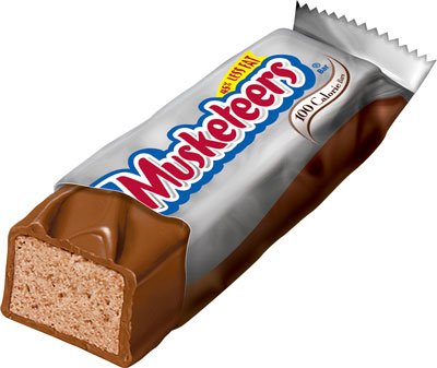
The second example I found is the letter M from a 3 Musketeers Wrapper. This font is very playful, due its balloon-like appearance. It seems almost little-kidish, which could appeal to young consumers and also to adult consumers who want to just take a time out from their busy lives to eat a piece of candy. Incorporating my last example, I do not think switching the fonts for the letter M of these packages would work. The fonts would not enhance the other product if switched. Each font works for its specific package, product, and purpose.
My final example of the letter M in packaging is from a Maybelline advertisement. This is a san serif font, with very straight thin edges and lines. This gives off the appearance of very classy and more upscale, which is a great persona for a make up to have. It is a very simplistic style but an air of sophistication to the product.
I think each use of the letter M in each packaging is well thought out and used well to enhance each product. None of the fonts would work as well if there were interchanged to be on another product. It's surprising how much each typography style has an impact on the product they are on, and how different one letter M can be from another.

Some interesting and well thought out observations about typography in this post.
ReplyDelete