Sunday, March 7, 2010
Bad Advertisement
The ad I chose for my design project this week was an ad for a photography company called Creative Works Photography. The ad had a very outdated picture of a wedding couple with big blocks of text with the only color being a slight splash of red in the background. I did not think the layout, typography, or color communicated that it was a creative photography studio at all. I think the colors needed to be changed to make it more updated and show off a level of creativity so show that their name really encompasses who they are as a company. I think the picture needed to be changed to a more modern and relevant photo. I think the text needed to flow better within the ad as well, so there were not just big bold chunks of text all over the page. I think this would definitely help the ad flow better and work well to communicate the message that Creative Works Photography is trying to give off to potential clients.

Sunday, February 21, 2010
The Letter M in the World of Advertisements
We take the way typography enhances packaging and a products overall feel for granted. The font choice, the position of the lettering, the coloring and even more can make or break a packaging design. I chose to evaluate the letter M in various advertisements and packaging that we as Americans see all the time.
The first example I found of the letter M is the M from a Caribbean Rum bottle, Malibu. The font is a serif font and its very free flowing, lacking straight form with the edges not cut and dry. This gives off the feeling of an easy going, good time, which I think is a very prominent experience an alcohol company would want their company to give the impression of.
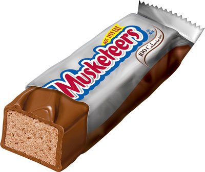
The second example I found is the letter M from a 3 Musketeers Wrapper. This font is very playful, due its balloon-like appearance. It seems almost little-kidish, which could appeal to young consumers and also to adult consumers who want to just take a time out from their busy lives to eat a piece of candy. Incorporating my last example, I do not think switching the fonts for the letter M of these packages would work. The fonts would not enhance the other product if switched. Each font works for its specific package, product, and purpose.
My final example of the letter M in packaging is from a Maybelline advertisement. This is a san serif font, with very straight thin edges and lines. This gives off the appearance of very classy and more upscale, which is a great persona for a make up to have. It is a very simplistic style but an air of sophistication to the product.
I think each use of the letter M in each packaging is well thought out and used well to enhance each product. None of the fonts would work as well if there were interchanged to be on another product. It's surprising how much each typography style has an impact on the product they are on, and how different one letter M can be from another.
Thursday, February 11, 2010
Color in Different Cultures
In the United States, Red means STOP, Yellow means SLOW DOWN, and Green means GO. Have you ever thought what these colors mean in various other cultures throughout the United States. This is exactly what I took the time to examine this week. As a tribute to Valentine's Day, let us investigate the color RED.
In the Western culture, red has two meanings; mainly love and/or rage and anger. However, in China the color red is meant to mean a celebration. By following the link you would notice all the Chinese decorations are all in red!
In South Africa, the color red is the color of mourning. It is used at funerals or to indicate various sorrowful events for a family or individual. In India, red is the color of purity, which is very different from the United States, where purity is indicated by the color white. In a completely opposite perception, the United States considers red as associated with the devil, while in India, the color red is holy and is instrumental in customs and beliefs.
As can be seen across cultures, one color can mean so many different things. In advertising and marketing, we must learn how color is perceived by various cultures so we can create ads pleasing to all areas of the world if we ever have the privilege to work worldwide.
Thursday, February 4, 2010
Color Schemes
I could have told you starting about 10 years ago that my favorite color scheme was lime green and bright pink. There was something about the combination of colors together that I found interesting and their vibrancy and brightness was an extra bonus. Come to find out lime green and bright pink are actually opposite each other on the color wheel, meaning they are complimentary colors. One real life example I found was the packaging on a Bed Head Hair Product called EGO BOOST. The bottle is bright pink, with a light green cap/pump. If I saw this product sitting on a self, my eye would immediately be drawn to it. Not only are the colors my favorite, but the vibrancy of the colors demand attention. This is an excellent marketing idea because consumers would be more drawn to this bottle than say a black and white bottle on the same shelf.
The color combination also adds to the overall perception of the product and brand. I would not look at the packaging and think "wow this is a pretty standard, boring brand of hair care products". The bottle makes it scream to the consumer that the brand is fun, funky and a brand for the more youthful at heart. Before learning about how much color impacts our thoughts on a brand and product, I would have never believed the color combination of pink and green could really change a consumer's perception of a product. However, now I see a color scheme can actually make or break the success of a product and a brand. MARKETERS BEWARE!
Thursday, January 28, 2010
The Elements of Design
Have you ever wondered what makes a composition, work of art, advertisement, or even a piece of graphic design harmonious? I can honestly say I have never taken the time to ponder this question until this week. Various design elements including balance, weight, scale, direction, positive and negative space, and repetition can all play a major part in making any piece of design pleasing to the eye in an interesting and unique way.
I found this week that I am a very symmetrical person. Not in my appearance or demeanor, but in the way I look at and create compositions. I found it increasingly difficult to create an asymmetrical. Every time I tried, it either turned out symmetrical or just a mumbled, jumbled bunch of shapes on a page; no balance at all. In order to rid me of my asymmetrical lacking, I looked up inspiration on the internet. One example of asymmetrical design and explanation really struck me. It explained and viewed how to create asymmetrical balance in a way that made sense to me. If you are having asymmetrical woes, follow the link above and you will steadily move toward recovery.
Thursday, January 21, 2010
What is Graphic Design?!
Do you know what graphic design actually consists of? On my search of this question, I did what any normal college student would: looked it up on Google. I, therefore, came up with this definition from aigi.org: "Graphic design is a creative process that combines art and technology to communicate ideas".
This definition is nice, but I wanted to dig deeper. What does graphic design really entail?! One thing is for certain: Graphic Design is around humanity almost 24/7. Think about it: From the wrapper around the Sobe Lifewater Juice I am currently drinking to the SELF magazine cover sitting on my desk, each was created by a graphic designer with a specific look, feeling, and vibe in mind. Each was made uniquely to communicate a specific message to its consumers and its audience. With this in mind, it is my opinion that graphic design is a thoughtful, creative process used to communicate a unique and pleasing message to consumers or a specific market. If graphic designers failed to complete the process, daily items we consume would be ordinary and bland. Therefore, next time you pick up any household item, such as a piece of gum or a box of band aids, think about the specific and unique graphic design of that product and what message and feel it is trying to communicate to you the consumer.
Friday, December 11, 2009
Google Enhances Its Social Media Ties
Google will now have, what it calls, a real time search page. Google's new real-time display will be more interactive than the usual static search engine results page we have seen previously. The display will feature a scroll along bar with a pause button that will allow people to stop and start results pages and the paid advertising on the side. With this new infrastructure, google will be partnering with Facebook, Twitter, and MySpace to get help with their real-time results. This will also give the most up-to-date trends for people to be able research.
My first reaction when reading this news story was, what difference will this really make with search results and why did Google think it necessary to take this step? I soon found out! Google's partnering with Twitter comes from the ever-growing competition and pressure Bing is putting on Google's search engine. Google hopes that this new partnership and real time search display for the most updated trends and search results will help leave Bing in the dust. Is this effort by Google enough to keep Bing away? Only time will tell.
Subscribe to:
Posts (Atom)